recently, for my capstone project I've been researching on transdisciplinary works and have found some amazing things.
Works of Lucy McRae : Lucy McRae straddles the world of fashion, technology and the body. Trained as a classical ballerina and architect her work inherently fascinates with the human body
Chlorophyll Skin from Lucy McRae on Vimeo.
RAT Vs POSSUM 'FAT MONK' OFFICIAL MUSIC VIDEO from Lucy McRae on Vimeo.
SOI
Friday, 18 November 2011
Wednesday, 26 October 2011
SS12
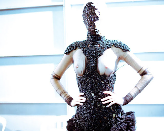
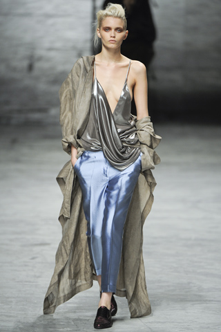
These are some of the photos from SS12 fashion week I saved under inspirations. Breathtaking designs from Haider Ackerman and Sarah Burton (for McQueen), as well as some other photos.
The inspirations from McQueen was the sea, the corals. The pastel orange and pinks really do remind me of the beautiful coral I saw at the Great Barrier Reef. Nature is certainly the biggest inspiration source for some. The garments show that there are still true innovative designers out there and not just fashion stylists for maisons.
The inspirations from McQueen was the sea, the corals. The pastel orange and pinks really do remind me of the beautiful coral I saw at the Great Barrier Reef. Nature is certainly the biggest inspiration source for some. The garments show that there are still true innovative designers out there and not just fashion stylists for maisons.
 |
| Givenchhy ss12 |
 |
| Celine ss12 |
 |
| Kenzo ss12 |
 |
| McQueen ss12 detail |
 |
| Above via self service blog, photos by Morgan O'Donovan, I love the tone of these photos, desaturated and on the cool side. It seems as if the models were taken out of the the chaotic surroundings of backstage. |
 |
| via style.com |
 |
| Haider Ackerman ss12 via style.com |
 |
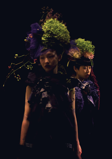
| beautiful presentation for furfur from Tokyo fashion week. More photos via Igor + André |
Monday, 10 October 2011
Illustration Project - After Dark
Recently Nowness.com, a website which I frequent for the latest in fashion, art and culture has posted a drawing competition. Participants will submit a 2D artwork whether illustration, photogrpahy or digital art based on author Murakami's novel or shortstories.
I was very excited about this because I've been a fan of Haruki Murakami, and he's a well known author in China. So I revisited his novel After Dark, which describe a series of events happened between 11:59 pm to 6:52 the next morning. I was touched by the characters and felt very much related to them - different people all have their own stories and their own way in dealing with troubles or confusions, however those who don't know you well, or even those who do, in this case the sisters, will not completely understand, in this way, everyone is quite lonely and alienated.
When I was reading the final part of the novel, I imagined the sister Mari, lying in bed with Eri, and when I flipped to the next page, she did exactly what I had imagined, and I knew this is the scene I will depict.
I looked for some inspirations - particularly Aubrey Beardsley's drawings and also came across with these. So awesome. I really enjoy Yamamoto's grotesque illustrations, and the max amount of detail is simply breathtaking.Unfortunately I wasn't able to find any good resolution ones.
I started with a rough sketch, and then a full-sized pencil drawing - constantly refining the figures and composition. I have a lot of difficulty drawing from my mind, so I had to look up many stock photos for furniture or patterns. This process took about one day. Next, I traced the drawing on to illustration board. I used Frisket to mask the white areas of the pattern and went to bed.
The Second day, using ink with different brushes I filled in the lines and patterns. It took about 5 hours.
The cherry blossom pattern is an strange force that is sort of protecting the two girls and hopefully everyone of us. It is the sense of optimism the novel ended with, after all, dawn is here and the new day begins. I feel that the digital translation is not quite there, the texture of the paper and ink is lost which is a bit of shame, I should take a better photo next time.
I was very excited about this because I've been a fan of Haruki Murakami, and he's a well known author in China. So I revisited his novel After Dark, which describe a series of events happened between 11:59 pm to 6:52 the next morning. I was touched by the characters and felt very much related to them - different people all have their own stories and their own way in dealing with troubles or confusions, however those who don't know you well, or even those who do, in this case the sisters, will not completely understand, in this way, everyone is quite lonely and alienated.
When I was reading the final part of the novel, I imagined the sister Mari, lying in bed with Eri, and when I flipped to the next page, she did exactly what I had imagined, and I knew this is the scene I will depict.
I looked for some inspirations - particularly Aubrey Beardsley's drawings and also came across with these. So awesome. I really enjoy Yamamoto's grotesque illustrations, and the max amount of detail is simply breathtaking.Unfortunately I wasn't able to find any good resolution ones.
 |
| A.Beardsley |
 |
| Takato Yamamoto |
I started with a rough sketch, and then a full-sized pencil drawing - constantly refining the figures and composition. I have a lot of difficulty drawing from my mind, so I had to look up many stock photos for furniture or patterns. This process took about one day. Next, I traced the drawing on to illustration board. I used Frisket to mask the white areas of the pattern and went to bed.
The Second day, using ink with different brushes I filled in the lines and patterns. It took about 5 hours.
 |
| masking fluid not removed yet |
 |
| Final illustration |
Sunday, 2 October 2011
overlapping gives the work another dimension
some other nice illustrations
 |
| via booooooom |
some other nice illustrations
 |
| Ruben Ireland |
 |
| Riikka Sormunen |
Wednesday, 8 June 2011
Repetition and New Varieties
Using normal day-to-day objects, we are about to create something NEW. for this project I used nuts and bolts, colorful yarn, wire, plastic crystals and glue.
Part I
Making connections: Develop three joint systemsMy laptop has crashed recently and I lost some photos of the initial joint systems. Gladly there are the drawing which are nonetheless accurate and realistic.
Part II
After completing three joint systems, I did some visual research on growth. I found the growth of cactus interesting. There are many varieties and I used collaging to combine the three joined systems as well as exploring different types of growth.
Part III
Looking at the collages I began to make the actual composition using the materials I had. I first made many sub-element, consisting of a few screws with different colored yarn with varying joining methods. The linkage between each sub-element raised some difficulty. I ended up using the wire and crystals, as one is thin and the other transparent. The result resembles the quality of the collage because it seems that each element is faintly connected to one another.
I grouped the sub-elements into another sub-element which form the new structure. They can be arranged in infinite(well almost) ways to create different combinations.
Part IV
Final products in different environments
Even though the materials are all manmade but the structure itself has organic qualities. I had the idea of photographing them against rocks. I also found the grain of wood add to the texture and organic quality so I incorporated both. I did not stack the elements together in this photo because I wanted to make them look as if they are gems/jewels discovered in nature, in between the cracks of rocks or wood. The the colors of the jewel become even more vibrant against the neutral colored rocks.
Walking around, I saw this structure on a playground, I had no idea what it was for. But I though it's a perfect holder for the pieces, so I placed them on there and took the pictures. I found it suitable for its vibrant colors, and metal - all parallel to my structure
Also found an very interesting turtle made of metal. My structure had shared the same component - the screws. Aslo it juxtaposes nature and manmade - the theme of my structure. Both are organic, yet had a very industrial look.
Tuesday, 24 May 2011
Quick 2D-3D Exercise
In the beginning of week 10 class, we did a quick exercise with sheet material to create 3-D structures. They were required to have different qualities and here are the results.
Dense/Layered Structure
Textured/Decorative
Open/Permeable
2D-3D Emerging Formations
The process and the end result are both important for a designer. Usually the process involves problem-solving which can lead to a quite linear route and limit creativity. However, for this exercise and the following project, Jacqui tries to teach us a new creative process, which is a series of steps that form the end product rather than predicting the outcome first. It is rather spontaneous yet you can create "rules" or limitations that help to define the final product at the same time.
So the first step was to create some drawings using ink and markers. Listening to the music I made spontaneous random lines, shapes, volumes, and forms (pictured above).
Second, I made collage of the drawings and combined the formal elements in to one. When making these, I identified qualities that were present in the drawings such as structural, fragile, intricate, calm, chaotic, and coarse/rough.
Photocopies of the collages (above) are made to be worked into 3-D mauettes (Below)

Subscribe to:
Comments (Atom)


